Creating a Tuxbar for Tuxboard
Tuxbars, or toolbars for Tuxboard, enhances a user's experience. In this post, we'll build a Tuxbar from scratch for commonly-used tasks

What's Next?
- Introducing Tuxboard
- Layout of a Tuxboard dashboard
- Dashboard Modularity using Tuxboard
- Moving Widgets in Tuxboard
- Creating a Tuxbar for Tuxboard
- Managing Layouts in Tuxboard: Simple Layout Dialog
- Managing Layouts in Tuxboard: Advanced Layout Dialog
- Adding Widgets with a Tuxboard Dialog
- Using Widget Toolbars (or Deleting Widgets)
- Creating User-Specific Dashboards
- Creating Default Dashboards using Roles
- Creating Default Widgets using Roles
- Creating Custom Tuxboard Widgets
Full examples located at Tuxboard.Examples.
In the last post, we were able to move widgets on the dashboard and save their positions, but we need to take our dashboard further.
While this is great for customization, we need a way to interact further with our dashboard.
In this post, we'll create a Tuxbar, attach it to an existing Tuxboard, and add controls to the Tuxbar for additional functionality.
Defining a Tuxbar
While this is more of a branding idea, a Tuxbar is nothing more than a button toolbar used in conjunction with a Tuxboard dashboard.
The Tuxbar is also considered an optional component. If a Tuxboard is meant to be static containing specific components for every user logging into a system, a Tuxbar wouldn't be necessary.
A Tuxbar could include any one of the following controls:
- Refresh the dashboard
- Change the Layout
- Add Widgets
- Display messages
- Status indicators
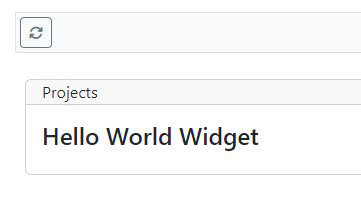
For our purposes, we'll create a Tuxbar right above the existing dashboard as shown below.

Tuxbar components are located in the Pages\Shared\Components\Tuxbar folder and are no different than any other ViewComponent for Razor Pages.
For now, let's create the Tuxbar control to house everything and include two controls.
Pages\Shared\Components\Tuxbar\Default.cshtml
@model Tuxboard.Core.Domain.Entities.Dashboard
<div class="tuxbar btn-toolbar border border-1 bg-light p-1 mb-3" role="toolbar" aria-label="Tuxbar for Tuxboard">
    <form>
        <div class="btn-group btn-group-sm">
            <button type="button" id="refresh-button" title="Refresh" class="btn btn-outline-secondary">
                <i class="fa fa-arrows-rotate"></i>
            </button>
        </div>
        <div class="btn-group btn-group-sm mx-2">
            <span id="tuxbar-status"></span>
        </div>
    </form>
</div>
Pages\Shared\Components\Tuxbar\TuxbarViewComponent.cs
[ViewComponent(Name = "tuxbar")]
public class TuxbarViewComponent : ViewComponent
{
    public IViewComponentResult Invoke(Dashboard model)
    {
        return View(model);
    }
}
Our Tuxbar will include a Refresh button and a Tuxbar message for displaying messages.
Let's add the Tuxbar to our Index.cshtml file.
@page
@model IndexModel
@{
    ViewData["Title"] = "Home page";
}

<vc:tuxbar model="Model.Dashboard"></vc:tuxbar>

<vc:tuxboardtemplate model="Model.Dashboard"></vc:tuxboardtemplate>
We also need to attach the Tuxbar to our dashboard which is shown below (in Tuxbar.ts).
export class Tuxbar {

    private controls: ITuxbarControl[] = [];

    constructor(private readonly tuxboard: Tuxboard, private readonly selector: string) { }

    public getDom = () => document.querySelector(this.selector) as HTMLDivElement;

    public getTuxboard = () => this.tuxboard;

    public getTuxboardService = () => this.getTuxboard().getService();

    public get = (selector: string) => {
        return this.controls.find(ctl => ctl.selector === selector);
    }

    public initialize = () => {
        this.controls.push(new RefreshButton(this, defaultTuxbarRefreshButton));
        this.controls.push(new TuxbarMessage(this, defaultTuxbarMessageSelector));
    }
}
Our constructor takes in a Tuxboard and a DOM selector to identify the Tuxbar. Once we have both, we can create utility methods and our initialize() method.
If you notice at the top, we define an array of ITuxbarControl. All controls implement the ITuxbarControl. Currently, there are two controls available: a TuxbarButton and TuxbarMessage. It doesn't mean we may have more in the future, but 90% of the time, buttons and messages are the most common.
The .initialize() method attaches the scripts to our DOM elements. The defaultTuxbarRefreshButton and defaultTuxbarMessageSelector variables are located in the common.ts file to consolidate the naming of DOM elements.
Attaching the Tuxbar
Remember the dashboard.ts file we created?
This is the file to attach our Tuxbar to our dashboard.
ready(() => {
    const dashboard = new Tuxboard();
    dashboard.initialize();

    const tuxbar = new Tuxbar(dashboard, defaultTuxbarSelector);
    tuxbar.initialize();
})
Since we need methods from the dashboard, the best approach was to pass the dashboard to the Tuxbar so we can act on various methods contained in the dashboard.
Let's look at the RefreshButton.
Creating a Tuxbar Button
As mentioned before, all controls on the Tuxbar should implement the ITuxbarControl. Everything inherits from a TuxbarControl which is considered a base class.
If we wanted to create a new button, we would inherit from a TuxbarButton. All buttons include the all-to-familiar addEventListener for clicking the button as shown below.
export class RefreshButton extends TuxbarButton {

    constructor(tb: Tuxbar, sel: string) {

        super(tb, sel);

        const element = this.getDom();
        if (element) {
            element.removeEventListener("click", this.onClick, false);
            element.addEventListener("click", this.onClick, false);
        }
    }

    onClick = (ev: MouseEvent) => {
        const message = this.tuxBar.get(defaultTuxbarMessageSelector) as TuxbarMessage;
        if (message) {
            message.setMessage("It's clicked.", false);
        }
    };

    getDom = () => this.tuxBar.getDom().querySelector(this.selector);
}
Each control must pass in a Tuxbar instance and the DOM selector of the button. In this case, the DOM selector is "#refresh-button".
Accessing Other Controls on a Tuxbar
In the onClick event, you'll notice we use the Tuxbar instance to look for another control on the Tuxbar: the Tuxbar Message.
const message = this.tuxBar.get(defaultTuxbarMessageSelector) as TuxbarMessage;
This returns a control from inside a control. That way, if there is a control on the Tuxbar requiring additional functionality based on the status of another control, it can be updated to reflect the button's functionality.
It also makes the syntax of this statement a little more readable ("On the Tuxbar, get me the TuxbarMessage control so I can display the status of this control").
Creating Additional Controls
Once we create the control through HTML, we can attach events to our control.
For example, the TuxbarMessage control is as simple as they come.
export class TuxbarMessage extends TuxbarControl {

    constructor(tuxBar: Tuxbar, selector: string) {
        super(tuxBar, selector);
    }

    public getDom = () => this.tuxBar.getDom().querySelector(this.selector);

    public setMessage = (message: string, fade: boolean) => {
        const control = this.getDom();
        if (control) {
            control.innerHTML = message;
        }
    };

    public clearMessage = () => {
        const control = this.getDom();
        if (control) {
            control.innerHTML = "";
        }
    };
}
When creating a Tuxbar control, use the guidelines below.
- Inherit from
TuxbarControl - Constructor should always pass in a Tuxbar instance and a selector to find the control on the Tuxbar
In our TuxbarMessage example, we pass in the Tuxbar instance and the selector of the control ("#tuxbar-status") and create additional methods for external use (setMessage and clearMessage).
Adding a Control to the Tuxbar
When adding a new control to the Tuxbar,
- Confirm the naming of the control's selector; Identify whether it's a class (
.tuxbar) or an ID (#tuxbar). - Add the control through the
.initialize()method in theTuxbar.tsfile confirming we're passing an instance of a Tuxbar and a valid selector pointing to the Tuxbar's control. - In the
.initialize()method, the order of the controls do not matter; If the controls are displayed how we want them in the HTML, it doesn't matter the order of the controls in the array; They will always point to their respective control through their selector.
To add a new control to the Tuxbar, follow the steps below.
- Add the HTML to the Tuxbar ("
<button id='#mybutton'>") - Create the selector of your control in common.js ("
export const defaultTuxbarMyButtonSelector='#mybutton';") - Create the control using TypeScript ("
this.controls.push(new MyButton(this, defaultTuxbarMyButtonSelector));") - Add additional methods and events to your control making it more functional to the user.
Calling Tuxboard Methods from a Tuxbar Control
Referring back to the RefreshButton, let's look at updating the functionality of this control to provide a complete implementation.
We need a way to refresh the whole dashboard which means calling the server to return a dashboard's layout.
First, let's focus on the C# side of things (ahh...fullstack).
Adding the Refresh Method (in C#)
The refresh method will be a new method on the dashboard page which is the Index page (IndexModel).
public async Task<IActionResult> OnPostRefresh()
{
    var dashboard = await _service.GetDashboardAsync(_config);

    return ViewComponent("tuxboardtemplate", dashboard);
}
The OnPostRefresh() method tells us two things: we need to perform a post to the refresh method (based on the prefix OnPostxxx) and we need to return a rendered ViewComponent of our dashboard which, in this case, is a "tuxboardtemplate".
I can hear everyone asking..."Why perform a postback to a page when we could do this with an API?"
From the FAQ in the Introducing Tuxboard post:
While I do love me a good ole API, the ability to render a ViewComponent on-the-fly and return back an "island of HTML" is a more attractive approach for a modular dashboard design. The API would require loading a ViewComponent, pass in a model (our variable called dashboard, in this case), rendering it, and returning it back through a JSON data object of some kind. Seems like too much work for something we can simply call and move on.
Remember a couple of posts back when we wanted to break the dashboard into modular components? THIS was the reason for breaking them apart into ViewComponents. There's just so many reasons to use ViewComponents.
Now that we have our Refresh method in place, let's turn our attention to the client-side.
Adding the Refresh Method (in TuxboardService.ts)
The Refresh method makes a "handler call" to our C# method and returns the ViewComponent back to us as rendered HTML.
private tuxRefreshUrl: string = "?handler=Refresh";

public refresh = () => {

    const request = new Request(this.tuxRefreshUrl,
        {
            method: "post",
            headers: {
                'Content-Type': 'application/json',
                'RequestVerificationToken': this.getToken(),
            }
        });

    return fetch(request)
        .then(this.validateResponse)
        .then(this.readResponseAsText)
        .catch(this.logError);
}
Again, since this is a single-page post for our dashboard, we only need to add a "?handler=Refresh" for our C# to execute.
Once we have the data, we can move on to the Refresh implementation...again!
Adding the Refresh Method (in Tuxboard.ts)
In our tuxboard.ts file, let's create our refresh method for updating the dashboard.
refresh = () => {
    this.service.refresh()
        .then((data:string) => {
            this.updateDashboard(data);
        })
}

updateDashboard = (data: string) => {
    if (data) {
        document.querySelector(defaultDashboardSelector).innerHTML = data;
        this.attachDragAndDropEvents();
    }
}
In the updateDashboard() method, we replace the inner HTML with our rendered dashboard. However, since we are replacing DOM elements in the dashboard, it's necessary to reconnect the DOM events so drag and drop events function as expected.
Adding the Refresh Method (in RefreshButton.ts)
Finally, we need to call our .refresh() method so let's modify our onClick event in the RefreshButton.ts file.
onClick = (ev: MouseEvent) => {
   this.tuxBar.getTuxboard().refresh();
};
The Refresh button implementation is complete!
Bonus Control: Spinning Indicator
How do we know the dashboard is loading or not? We need a progress indicator of some kind.
In our Tuxbar\Default.cshtml file, let's update it to include a spinner on the far right (changes are in bold).
@model Tuxboard.Core.Domain.Entities.Dashboard

<div class="tuxbar btn-toolbar border border-1 bg-light p-1 mb-3 justify-content-between" role="toolbar" aria-label="Tuxbar for Tuxboard">
    <form>
        <div class="btn-group btn-group-sm">
            <button type="button" id="refresh-button" title="Refresh" class="btn btn-outline-secondary">
                <i class="fa fa-arrows-rotate"></i>
            </button>
        </div>
        <div class="btn-group btn-group-sm mx-2">
            <span id="tuxbar-status"></span>
        </div>
    </form>
    <div class="input-group mx-3">
        <span id="tuxbar-spinner" hidden><i class="fa-solid fa-sync fa-spin"></i></span>
    </div>
</div>
The spinner is created through FontAwesome using the spin animation, but other cool animations are available.
Let's create the spinner through a TuxbarSpinner.ts file.
export class TuxbarSpinner extends TuxbarControl {
    constructor(tuxBar: Tuxbar, selector: string) {
        super(tuxBar, selector);
    }

    public getDom = () => this.tuxBar.getDom().querySelector(this.selector);
    public show = () => { showElement(this.getDom()); }
    public hide = () => { hideElement(this.getDom()); }
}
The showElement and hideElement are located in the common.js at the bottom. While we're in the common.js file, we need to add our selector name.
export const defaultTuxbarSpinnerSelector = "#tuxbar-spinner";
With our new spinner name and class available, we can add the spinner as a control to our Tuxbar. Since the control is located inside the HTML Tuxbar and on the far right, it doesn't matter where we add it in the Tuxbar array (changes in bold)
public initialize = () => {
    this.controls.push(new TuxbarSpinner(this, defaultTuxbarSpinnerSelector));
    this.controls.push(new RefreshButton(this, defaultTuxbarRefreshButton));
    this.controls.push(new TuxbarMessage(this, defaultTuxbarMessageSelector));
}
The last part to update is the onClick event in the RefreshButton.
onClick = (ev: MouseEvent) => {

    const spinner = this.tuxBar.get(defaultTuxbarSpinnerSelector) as TuxbarSpinner;
    spinner?.show();

    try
    {
        this.tuxBar.getTuxboard().refresh();
    }
    finally
    {
        spinner?.hide();
    }
}
The try..finally is meant to hide the spinner in case something bad happens. If something did happen, the spinner would hide letting the user know it either failed or completed. The user wouldn't be sitting there watching a spinner waiting for something to finish when an error occurred.
Conclusion
A Tuxbar is meant to add additional functionality to a dashboard overall. It can enhance a user's experience with layout styles, additional widgets, administrative tools, and even specific application functionality for specific users.
While a Tuxbar is considered an optional component, this post examined how to interact with the dashboard while building commonly-used controls to provide a better user experience overall.
Next, we'll look at how to use a Tuxbar to build dialogs for our dashboard.
What's Next?
- Introducing Tuxboard
- Layout of a Tuxboard dashboard
- Dashboard Modularity using Tuxboard
- Moving Widgets in Tuxboard
- Creating a Tuxbar for Tuxboard
- Managing Layouts in Tuxboard: Simple Layout Dialog
- Managing Layouts in Tuxboard: Advanced Layout Dialog
- Adding Widgets with a Tuxboard Dialog
- Using Widget Toolbars (or Deleting Widgets)
- Creating User-Specific Dashboards
- Creating Default Dashboards using Roles
- Creating Default Widgets using Roles
- Creating Custom Tuxboard Widgets
Full examples located at Tuxboard.Examples.


