DanylkoWeb Annual Redesign: A Different Approach
This year, I took a different approach and redesigned four aspects of my site. Today, I talk about all of the changes made to DanylkoWeb and why.

Every year for the past three years (since September 2014), I always try to redesign the site.
Each yearly redesign was a blog post/case study as to why I designed my site the way I did. The redesigns were posts in 2015, 2016, and then this year's design.
It may seem like a lot of work, but it should be considered one of your chores you do every day, week, month, quarter, or year as a housecleaning task.
I perform a yearly evaluation of my site for the following items:
- SEO Optimization
- Site performance
- New features (personal innovation and user requests) to keep readers coming back
- Goals for the upcoming year (it IS the tail end of November, remember?)
While some consider these tasks more of a monthly or quarterly endeavor, each website has their own agenda of how to update their site.
For example, when was the last time you saw a site update from the Washington Post that was radically different from the previous design?
Along with the examples above, I felt a need to redesign the website (again) because I wanted to:
- Keep the design fresh with the latest trends
- Give the readers what they requested
- Create a "case study" as to why I created/updated/deleted certain components
- Build a memorable "first impression" for new visitors
You always want your site to be attractive to readers.
Look at it this way...If you have awesome content with a bad site design, it's like serving dinner with fine china in a mobile trailer.
Agenda
This year, instead of doing everything in one big update, I wanted to focus on various aspects of the site from a higher level.
Each topic is meant to evolve the site; allow it to grow up, if you will. I wanted to give the site more of a personality.
Let's dig into the topics.
1. New Branding
Now, I know what you're thinking — What happened to the Vans?
I've always found Vans comfortable and every time someone saw me at a conference, they would know me by my Vans so I thought why not add them to the site since everyone identifies me by my shoes?
 |
 |
 |
Previously, every time the page was loaded, it would show one of three types of Vans I owned.
But alas, it was about time to replace the Vans with a more relevant logo for the site (but not remove them). ;-)

I LOVE the use of negative space in the logo, but I can't take the credit for it. I went to Fiverr.com and asked a number of designers to send me some design concepts.
After paying $25 for 5 Fiverr's perspectives, one designer stood out and I decided to pay a little extra (additional $30) for a solid design (if you are interested in the name, let me know).
Sometimes it's the simplest designs that make the most impact.
2. New Design
Bootstrap 4
The biggest part of this year's design was using Bootstrap 4...
*cough*cough*beta*cough*
Since I heard about Bootstrap 4, I was excited to hear it was coming.
That was around May...
I initially had plans of redesigning the site with Bootstrap 4 from the get-go, but it's still in beta.
My thought: it's better than an alpha state.
NOTE: IF YOU ARE THINKING ABOUT USING BOOTSTRAP 4 BETA, keep these two pages up in your browser as you redesign:
- Migration Guide (https://getbootstrap.com/docs/4.0/migration/)
- Components (https://getbootstrap.com/docs/4.0/components/)
I found the migration guide invaluable where the components guide was more of a "oh, this changed, so I need to change it to this."
Landing Page
On the main page, you'll notice I had a subscribe button along with social network icons above the fold. When someone would click the Subscribe button, it would slide to the bottom of the page using JavaScript where they would enter their first name and email address.
There is a problem with this technique: You can't track conversions very well.
For my subscription page, I wanted to have a dedicated landing page so I could clearly track conversions. This makes it easier to track goals in Google Analytics as well.
Remove Unused Components
Speaking of Google Analytics, their bubble percentages in their In-Page Analytics (heat map) presented me with some issues in my design.
The following were removed from the site:
- Subscribe in the sidebar

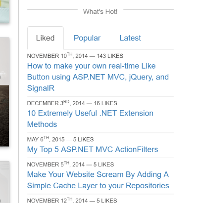
- The What's Hot which included the Latest Posts, Most Popular, and the Most Liked posts
- The Subscribe Box at the bottom of the main page.

- Removed the Share buttons at the bottom of the post.
- Removed the yellow Subscribe box at the bottom of the post as well.
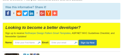
These features were not attractive to users at all so I removed them to save rendering cycles.
Redesigned About Page
The About page is more focused about what I'm presenting and going to present to my readers.
3. New Features
Christmas Pages
Along with my yearly redesign of the site, I also search out technology gifts of interest to those techies out there to help moms, dads, sisters, brothers, and grandparents to help with gift-giving for the holidays.
The Christmas Pages are located here.
Start Here Page
When a visitor arrives at your site, you want to give them a warm welcome and present them with top quality content so they are interested in what you offer.
It's the first item in the new navigation bar across the top so it doesn't matter what page they land on, they can always click on the "Start Here" link to get a feel for the type of content on the site.
Check out the Start Here page.
Morning Coffee Link RSS Feed
Since the beginning of DanylkoWeb, the Morning Coffee Link has always been available every weekday.
It's always available and posted on Twitter, LinkedIn, Facebook, and Google+.
Since it's presented on each social network, I thought I would add another channel so you can get your Morning Coffee Link delivered right to your RSS Feed Reader.
Here is the Morning Coffee Link RSS Feed.
DanylkoWeb Search from OmniBar
After going through my Google Search Console, one of the recommendations was to make the search on your site GET-based instead of POST-based.
I didn't think this would give me much of a lift of traffic, but after implementing this on the site, I see the benefit.

If you are using Chrome, the Omnibar (or address bar) will turn into an immediate search textbox. Type in your query and hit enter. This sends that GET-based query to your site once you have your parameters set up.
Nice touch.
4. New Slogan
DanylkoWeb has always focused on ASP.NET MVC and everything associated with it.
The site's previous slogan was meant to provide a resource for developers to learn how to use ASP.NET MVC.
Three years later, the site grew and so did the technologies attached to it. The web world is becoming more standards-based instead of proprietary (yes, I'm looking at you WebForms).
Along with that manner of thinking, this past Black Friday and Cyber Monday has proved my point even further with mobile sales of $2B alone. along with almost 60% of searches are conducted through a mobile device.
My point here is it doesn't matter which technology you use. These web standards are becoming more and more common in regards to mobile development.
And when I say mobile development, I mean mobile WEB development with technologies like SPAs, Progressive Web Applications, and JavaScript Frameworks to achieve the same performance as a native application.
When I wrote posts about mobile web development, I noticed through Google Analytics that I received solid feedback and traffic when talking about how to create Aurelia applications or how to write a Progressive Web Application using Visual Studio.
Moving forward, I want DanylkoWeb to focus on mobile web technologies along with using ASP.NET MVC and MVC Core as the server-side language.
The new slogan for DanylkoWeb is Responsive and Mobile Web Solutions using Microsoft Technologies.
Conclusion
While this list seems like a lot, I will be adding even more features in December based on user feedback and will update this post to reflect those changes.
DanylkoWeb - Snapshots of 2016 Layout Pages
Did you want something added to the redesign? Did I miss a feature? Post your comments below and let's discuss.
