My Thought Process When I Redesigned DanylkoWeb
Over the weekend, DanylkoWeb was successfully given a facelift. Today, I cover the various news-related web design articles that convinced me to move towards this particular design.
It's been a little over a year since I launched DanylkoWeb and it's been an awesome journey so far with my readers, but as I mentioned in August, I was planning on making some changes to the site.
Well, this weekend, I gave DanylkoWeb a facelift and was watching the site to make sure no issues came up.
Of course, you're probably noticing a couple of changes on the site already as you read this post.
While I am far from being a web designer, I wanted to give everyone a walk-through of what was going through my mind as I redesigned DanylkoWeb.
Each section will focus on what it was, what it is, and why I decided to go in that direction.
Why the redesign?
I'm sure a number of you are wondering why I decided to redesign the site so "early" after it's launch a year ago. Here are a couple of reasons:
- I wanted to keep everything fresh and updated for my audience. I don't just sit on my laurels.
- I like to show a steady evolution of a website. I don't like stale websites and I'm pretty sure most users don't care for them either. If a site is meant to evolve over time, it should contain subtle and not drastic changes where the subtle changes wouldn't confuse the audience from the existing functionality they are already accustomed to on the site.
- A number of programmers (even some of my friends) are not considered designers. I thought this would be a great way to explain how "designers" look at evolving a site.
- In a year's time, I've learned various techniques that I wanted to apply to the site. I thought "what better time than now?"
So let's attack the Home page, shall we?
Home Page Redesign
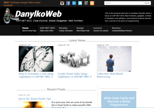
Of course, this was the big one, Elizabeth! I wanted to make sure the site was easy enough to navigate, but not too congested. Let's look at what it was before the redesign.
Header
What it was
The header was one of my issues with the site. As you can see, it's hard to focus on one particular item.
I needed to remove some "distractions" from the header.
What it is
All that was necessary for the reader when they visit the site is the name of the site, what the site is about, a consistent navigation menu and search box.
The social icons were removed from the header and moved lower to the right sidebar.
The description was removed. In the future, I may redo the by-line (the text under the website title) for those who need a better description of the site.
Why did you do this?
Over the past six months, I visited a site called Peek. Peek is a service where you submit your site and a real person is asked three questions regarding your site. The great part about this service is that it's recorded in a video for you to examine later.
All three people mentioned that the site was way too busy. After hearing it from multiple people, I had to agree. There was too much going on in the header to decide what to do.
Another reason I changed the header was because the latest trend is "less is more."
The less distractions for your readers "above the fold," the more clearer their path is to locate something.
I've also added a little Easter Egg. I made each pair of Vans shoes a random image (3 in total) so the next time you visit, you may have a different pair of shoes in the header. The reason I place those in the header is because it's becoming my brand. Anytime someone sees me, they associate the shoes with my site.
A little bit of trivia: These are all Vans that I currently own ("Off the wall", baby!)
Layout
What it was
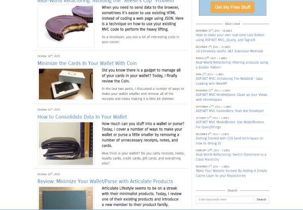
The layout of the site was more of a listing of posts instead of a self-contained component. There were minimal borders around each component and they were consolidated.
Granted, there were individual lines blocking off sections, but everything was thrown together and separated with a line or two (yes, I'm critiquing my own design) ;-).
What it is
I wanted to keep the "above the fold" summary of the latest posts, but this time I wanted to display four instead of three (ehh). Since I changed the layout from container to a "container-liquid" layout, I could add another card and not worry about running out of space.
The top four had their own row, but in the Recent Posts section, it's all card- based now with Masonry.
Why did you do this?
I'm sure I'll get a lot of flack for this, but here are my reasons for moving towards a card-based layout.
- The de facto standard of CSS frameworks, Bootstrap, has released an Alpha 4.0 version and included a card-based framework. While I didn't implement Bootstrap 4.0 into DanylkoWeb, I look forward to using their card framework.
- Cards are the latest web design trend for 2015.
- Pinterest and Google Now are two great examples.
- Why Cards are the Future of the Web
- How Cards are Taking Over Web Design
Along with the card layout, I also removed the paging and made the layout a little more dynamic by using AJAX to grab 20 additional posts every time they push the "Get More Posts" button at the bottom and automatically arrange them using Masonry.
There isn't a need for paging anymore.
Sidebar
What it was
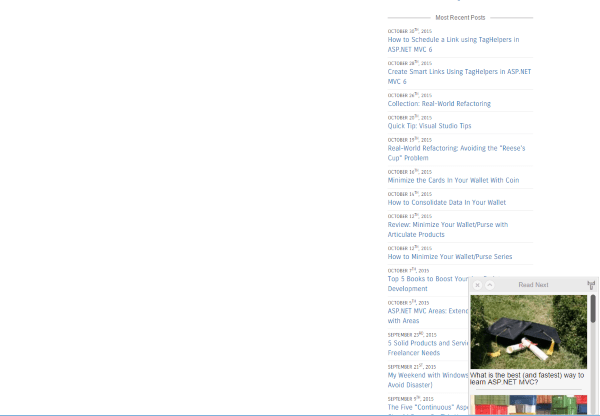
The sidebar had a lot of sections that were lists of posts and were taking up space. I needed a way to wrangle all of the lists together someway.
There were some additional irrelevant sections that were taking up space.
What it is
I took the three lists and made a single widget that contained all of the most liked, most popular, and the latest posts.
Why did you do this?
I wanted to keep the sidebar because even though it may seem like a distraction, it provides a number of other options instead of a navigation menu and an article.
The sidebar is now a little cleaner and it wasn't a complete reconstruction of the lists.
It was merely a subtle cosmetic enhancement that gave me "more of less" (more white space on the site).
Blog Post Page
What it was
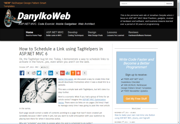
The post page had a very tiny font for the content of the article.
At the top, there was a sharing widget from AddThis.com to allow users to share the content with others.
What it is
The post page was the probably the least amount of changes made because I wanted to keep the layout similar to the old since it's actually the first thing that a majority of users see when they visit the site from a Google search.
Why did you do this?
I changed the layout to use a bigger font for the article on the post page because I received a couple of complaints about it.
The new redesign is meant to focus on subscribers and sharing on social networks so I made those pretty clear at the end of each blog post.
Other Features
A couple features that I didn't mention:
- Different Mobile Menu - When you view it in a mobile device, the menu has been converted into a slide out menu instead of the dropdown that Bootstrap is known for. I used the JASNY library to extend Bootstrap. I discuss it as one of the top libraries for Bootstrap and actually put it to good use in my web-based mobile app at ASP.NET MVC Optimization Series.
- Google AdSense and Affiliate Links - I've added a couple of Google AdSense banner ads and a couple of services that I definitely recommend. Keep watching this area for deals since the holidays are coming up.
- Removal of Trendemon - I've also removed Trendemon just to trim the JavaScript out of the payload sent down to the browser. I just didn't have a need for it anymore and it didn't provide any value to me in the end (sorry guys). Plus, I've had a couple users also tell me that it was annoying and a bit of a distraction when it slid up from the bottom (Trendemon is located in the second image on the bottom of the Layout graphic from above).
Conclusion
Based on everything I've redesigned over the three month period, I feel pretty comfortable and confident about how everything worked out with the end result.
Of course it seems to be mobile friendly as well (thanks to Google Mobile Friendly Tester).
I will be adding more subtle changes as I continue to evolve the site...so keep your eyes open.
We'll be in touch. ;-)
What do you think about the new design? Does it make sense or is it completely "fluster clucked?" Post your comments below.
