Quick Tip: How to Change Colors in ASP.NET MVC Charts
Today, I provide a simple way to change the colors of each series in your ASP.NET MVC web charts.

Today's quick tip is in response to one of my readers regarding a post I wrote called Simplified ASP.NET MVC Charts.
Bsman asked:
"Can we set different colors to the column charts?"
Absolutely!
Unfortunately, they're hidden, but it's nothing too hard to fix.
Charting through XML
The key to changing the colors is in the chart XML we used for our GetMyCustomTheme() method in the controller.
The chart XML is a serialized version of your chart object. When you define this as your theme, it deserializes it back into the object and uses these settings for it's visual effects.
To change the colors, there are two attributes in the Chart object that require your attention: Palette and PaletteCustomColors.
These are properties on the Chart object (from System.Web.UI.DataVisualization.Charting) so it makes manipulating properties a little harder doing it through the XML.Personally, I would rather do it through properties.
Since our chart is a Web.Helper, by nature, it attaches itself to the Chart object and makes it web-compatible.
The only change we need to make is to our Chart Element in the XML (changes in bold).
private string GetMyCustomTheme()
{
    return @"
    <Chart BackColor=""#555"" BackGradientStyle=""TopBottom"" BorderColor=""181, 64, 1""
        BorderWidth=""2"" BorderlineDashStyle=""Solid"" AntiAliasing=""All""
        Palette=""None""
        PaletteCustomColors=""97,97,97; 209,98,96; 168,203,104; 142,116,178;"">

        <ChartAreas>
            <ChartArea Name=""Default"" _Template_=""All""
                BackGradientStyle=""DiagonalLeft""
                BackColor=""Transparent"" BackSecondaryColor=""LightGray""
                BorderColor=""64, 64, 64, 64"" BorderDashStyle=""Solid""
                ShadowColor=""Transparent"">

                <Area3DStyle Enable3D=""True"" Inclination=""60"" Rotation=""45""/>
            </ChartArea>
        </ChartAreas>

    </Chart>";
}
We need to set the Palette to "None" and then define the custom colors through the PaletteCustomColors.
Each color is separated by a semi-colon (;) and uses an RGB color scheme.
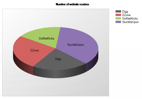
These colors are in order to how you entered your xValues. For example, Digg is our first xValue with the first color as 97,97,97 (gray). Dzone is the second xValue with the second color being 209,98,96 (red-ish) and so on.
Of course, not everyone can know these RGB color schemes off the top of their head. I recommend using the Color Picker Visual Studio Extension for adding the colors to your palette. It's one of the best tools for diverse color formats and color conversions.
If we run our demo, you can see the colors have changed.

You can also apply these colors to the other chart types as well.
Conclusion
Even though the Chart Web Helper doesn't expose a large number of properties, the chart XML demonstrates how detailed you can get by adding styles to make your charts stand out.
Is there another XML property you found to make your chart look visually appealing? Post your comments below.


