Using Widget Toolbars (or Deleting Widgets)
In today's post, we look at two ways to enhance widgets on your dashboard

What's Next?
- Introducing Tuxboard
- Layout of a Tuxboard dashboard
- Dashboard Modularity using Tuxboard
- Moving Widgets in Tuxboard
- Creating a Tuxbar for Tuxboard
- Managing Layouts in Tuxboard: Simple Layout Dialog
- Managing Layouts in Tuxboard: Advanced Layout Dialog
- Adding Widgets with a Tuxboard Dialog
- Using Widget Toolbars (or Deleting Widgets)
- Creating User-Specific Dashboards
- Creating Default Dashboards using Roles
- Creating Default Widgets using Roles
- Creating Custom Tuxboard Widgets
Full examples located at Tuxboard.Examples.
In the last post, we demonstrated how to add widgets to a dashboard with a new Add Widget dialog.
While adding widgets is considered a fundamental feature of a dashboard, we currently need a way to remove a widget from the dashboard and there's a couple of ways we can do this.
- Add an 'X' to each widget header allowing a user to immediately remove the widget.
- Create an ellipsis to provide a dropdown with multiple options including a remove option.
In this post, we'll cover both ways to remove a widget.
What is a Widget Toolbar?
A widget toolbar is a collection of buttons in the header of each widget. Each widget can have it's own functions depending on the type of widget.
For now, we'll focus on placing a button in the widget toolbar to remove a widget from the dashboard.
While creating dialogs is a bit intimidating, creating widget toolbars is a bit easier. We don't have a lot of moving parts, but it's an easier implementation.
Approach 1: Deleting a Widget
The first approach is adding a new button in the widget header to delete a widget.
Let's focus on the HTML first.
Adjusting the Widget Template (HTML)
Our first task is to update the widget template ViewComponent located in the Pages/Shared/Components/WidgetTemplate folder.
Since every widget contains headers, adding buttons to the WidgetTemplate will apply to all widgets.
If we look at the Default.cshtml file, our current WidgetTemplate looks like this.
<!-- Widgets -->
<div condition="Model.UseTemplate" class="card mb-3"
     data-id="@Model.WidgetPlacementId" draggable="true">

    <div class="card-header d-flex">
        <small>@Model.GetSettingValueByName("widgettitle")</small>
    </div>
     <div class="card-body">
        @await Component.InvokeAsync(Model.Widget.Name, Model)
    </div> </div>
For our purpose, the div.card-header is our primary focus.
Using FontAwesome again, we'll use the xmark icon inside the button and use flexbox for our layout.
.
.
<div class="card-header d-flex">
    <small>@Model.GetSettingValueByName("widgettitle")</small>
    <div class="widget-toolbar d-flex ms-auto">
        <button type="button" class="btn btn-sm remove-widget p-0">
            <i class="fa-solid fa-xmark"></i>
        </button>
    </div>
</div>
.
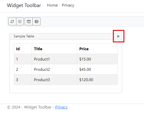
Our widget toolbar now contains a delete button.
Attaching a Delete Event (TS/JS)
The delete event is easy enough to implement and will reside in the tuxboard.ts file.
wwwroot/src/tuxboard/tuxboard.ts
attachWidgetToolbarEvents = () => {
    this.dashboard.querySelectorAll(defaultWidgetRemoveWidgetSelector)
        .forEach((item: HTMLButtonElement, index: number) => {
            item.addEventListener('click', (ev: Event) => this.removeWidget(ev))
        });
}

removeWidget = (ev: Event) => {
    ev.preventDefault();
    const target = ev.target as HTMLElement;
    const widget = getClosestByClass(target, noPeriod(defaultWidgetSelector)) as HTMLDivElement;
    const widgetId = widget.getAttribute(dataIdAttribute);
    this.service.removeWidget(widgetId)
        .then(response => {
            if (response.ok) {
                widget.remove();
            }
            return response;
        });
}
Our new attachWidgetToolbarEvents() method looks for the .remove-widget class and attaches a click event pointing to the removeWidget() method. The attachWidgetToolbarEvents() method is necessary in the initialize() method and the updateDashboard() method.
The getClosestByClass and noPeriod JavaScript functions are necessary to identify what widget we're in by examining the parent's class (CSS, not C#). These two functions are located in the common.ts file.
export function noPeriod(id: string) { return id.startsWith(".") ? id.replace(".", "") : id }

export function getClosestByClass(element: HTMLElement, classToSearch: string) {
    while (element) {
        if (element.classList.contains(classToSearch)) {
            return element;
        }
        element = element.parentElement;
    }
}
The removeWidget() method walks up the DOM tree by looking for a div element with a class of the defaultWidgetSelector (which is .card) and returns the widget id. We call our service method (removeWidget) and receive a response back. If the response we receive is ok, we remove the widget...but only if it's been Ok'd by the server.
Updating the Tuxboard Service (TS/JS)
Next, we implement the removeWidget() method in our tuxboardService.ts.
private tuxRemoveWidgetUrl: string = "?handler=RemoveWidget";
.
.
public removeWidget = (widgetId:string) => {

    var postData = {
        WidgetId: widgetId
    };

    const request = new Request(this.tuxRemoveWidgetUrl,
        {
            method: "post",
            body: JSON.stringify(postData),
            headers: {
                'Content-Type': 'application/json',
                'RequestVerificationToken': this.getToken(),
            }
        });

    return fetch(request)
}
Our service receives a widget id and prepares the request to send to the server. Once everything is created, we make the API call and perform a single fetch.
The fetch doesn't have our additional pipeline of methods because we only want to know whether the server returns an Ok (200) or a NotFound (404). If it is Ok, then we can remove the widget.
Removing the Widget (C#)
In the Index.cshtml.cs C# file, our TypeScript/JavaScript method calls the OnPostRemoveWidgetAsync() method and performs the delete.
public async Task<IActionResult> OnPostRemoveWidgetAsync([FromBody] RemoveWidgetRequest request)
{
    var dashboard = await _service.GetDashboardAsync(_config);

    // Use this as a way to identify a widget placement IN A DASHBOARD.
    var placement = dashboard.GetCurrentTab().GetWidgetPlacements()
        .FirstOrDefault(e => e.WidgetPlacementId == request.WidgetId);

    if (placement == null)
        return new NotFoundResult();

    await _service.RemoveWidgetAsync(placement.WidgetPlacementId);

    return new OkResult();
}
The RemoveWidgetAsync() method near the bottom takes in a WidgetPlacementId which is a Guid.
Why do we need to get the dashboard at the beginning? Why not simply call the RemoveWidgetAsync() method and be done with it?
When receiving a WidgetPlacementId from a JavaScript call, we need to validate it's a widget on the specific dashboard. This provides a security safeguard as opposed to someone simply passing in a random WidgetPlacementId and immediately delete it. While we aren't retrieving user-specific dashboards (yet!), this technique will benefit us in the long run in regards to security.
With everything in place, we can now remove widgets at any time.
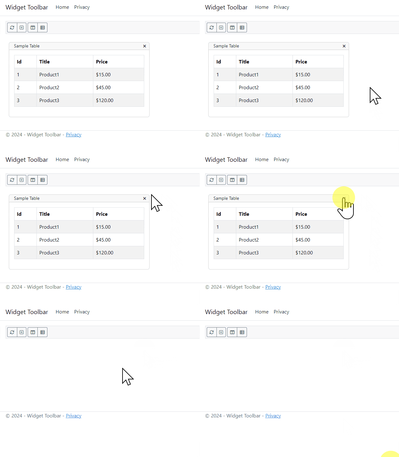
The downside to this approach is the immediate deletion of a widget without confirmation. We'll get to that in a bit.
Approach 2: Widget Options
The second approach places an ellipsis on a button which provides a dropdown list of items.
There are two reasons to create a widget header dropdown button:
- While I can immediately think of three buttons to place on a widget's toolbar, a dropdown gives a widget header some breathing room. We don't want to crowd the widget's header with too many buttons.
- With approach 1, the user only needs to click the 'X' once with no confirmation and the widget is gone. Even though it's one click, widgets don't contain any settings (yet!) and we can re-add a deleted widget. With a dropdown menu, it gives a user two chances, or two clicks, to confirm whether they wish to delete a widget or not.
In addition to creating the widget options dropdown, we can reuse a majority of the code and simply add a dropdown control to the widget's header.
Adding the Dropdown (HTML)
The good news is there is a minimal amount of work to add the dropdown button.
In the WidgetTemplate's Default.cshtml file, we'll comment out our first approach and add the HTML for the second approach.
<!-- Widgets -->
<div condition="Model.UseTemplate" class="card mb-3@(Model.Collapsed ? " collapsed" : string.Empty)"
     data-id="@Model.WidgetPlacementId" draggable="true">

    <div class="card-header d-flex">
        <small>@Model.GetSettingValueByName("widgettitle")</small>
        <div class="widget-toolbar d-flex ms-auto">
            @*
            <!-- Approach 1 -->
            <button type="button" class="btn btn-sm remove-widget p-0" title="Remove Widget">
            <i class="fa-solid fa-xmark"></i>
            </button>
            *@
            <!-- Approach 2 -->
            <div class="dropdown">
                <button class="btn btn-sm px-1 p-0 dropdown-toggle" role="button" data-bs-toggle="dropdown"
                        type="button" aria-expanded="false" title="Widget Options">
                    <i class="fa-solid fa-ellipsis"></i>
                </button>
                <ul class="dropdown-menu dropdown-menu-end">
                    <li><button class="dropdown-item remove-widget btn btn-sm" type="button"><small>Remove</small></button></li>
                </ul>
            </div>
        </div>
    </div>

    <div class="card-body">
        @await Component.InvokeAsync(Model.Widget.Name, Model)
    </div>

</div>
There are a couple of things to notice in the div.dropdown-menu.
- We're using FontAwesome again with an ellipsis to identify it's a menu.
- Instead of links (<a href="">), buttons are used for selecting the menu items. For some transparent foreshadowing, Approach 1 used a button to delete a widget.
- The 'X' button used a class called '
.remove-widget'. To achieve the same effect as Approach 1, the same class can be applied to the 'Remove' button.
The only thing left is to add the events for the dropdown toggle through TypeScript/JavaScript.
Manually Triggering the Dropdown (TS/JS)
The last place to visit is the tuxboard.ts file to update the attachWidgetToolbarEvents() (changes in bold).
/* Widget Toolbar Events */

attachWidgetToolbarEvents = () => {

    this.dashboard.querySelectorAll(defaultWidgetRemoveWidgetSelector)
        .forEach((item: HTMLButtonElement) => {
            item.addEventListener('click', (ev: Event) => this.removeWidget(ev))
        });

    // Grab all dropdown-toggles from inside a widget's header and build them.
    document.querySelectorAll(defaultDropdownInWidgetHeaderSelector)
        .forEach((item: HTMLButtonElement) => {
        item.addEventListener('click', () => bootstrap.Dropdown.getOrCreateInstance(item).toggle());
    });
}
Funny as it sounds, the defaultWidgetRemoveWidgetSelector assignment of the click event stays the same. Remember, we applied the class to the button of the dropdown menu item. So the functionality of clicking the menu item will perform as expected as before.
The list of dropdown selectors exist in the common.ts file. The defaultDropdownInWidgetHeaderSelector defines itself as `${defaultWidgetHeaderSelector} ${defaultWidgetDropdownSelector}` which translates to '.card-header .dropdown-toggle'. We only want to focus on the dropdowns inside a card header as opposed to other dropdowns on the page if they exist.
Click events are assigned and, when clicked, performs a static method called getOrCreateInstance() and immediately issues a toggle() triggering the dropdown.
Once compiled, we can see the remove widget in action.
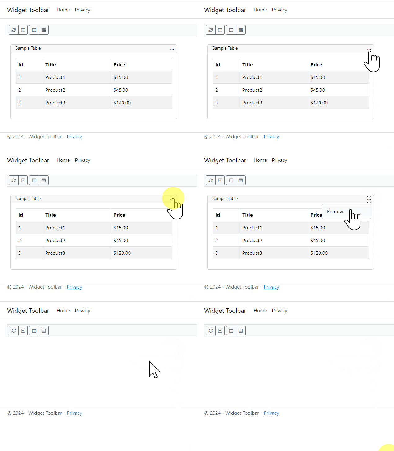
Since now we know how to add buttons to the widget toolbar, let's add one more.
Bonus: Minimize/Restore
The purpose of a minimize/restore button is to shrink or enlarge a widget to save space on a dashboard. We can place the button right before the ellipsis as a toggle between the two states.
However, we do need to save the state of each widget which requires another service. In turn, the widget template requires further modifications.
Adding the Buttons (HTML)
For our minimize/restore buttons to work, we need to add a button for the initial rendering of the widget (changes in bold).
<!-- Widgets -->
<div condition="Model.UseTemplate" class="card mb-3"
     data-id="@Model.WidgetPlacementId" draggable="true">

    <div class="card-header d-flex">
        <small>@Model.GetSettingValueByName("widgettitle")</small>
        <div class="widget-toolbar d-flex ms-auto">
            <button condition="!Model.Collapsed" type="button"
                    class="btn btn-sm widget-state p-0" title="Minimize Widget">
                <i class="fa-solid fa-window-minimize"></i>
            </button>
            <button condition="Model.Collapsed" type="button"
                    class="btn btn-sm widget-state p-0" title="Restore Widget">
                <i class="fa-regular fa-window-maximize"></i>
            </button>
            @*
            <!-- Approach 1 -->
.
.
Pay attention to the condition attribute on both buttons.
Each widget has a Collapsed boolean property where true means it's minimized and false is restored.
The collapsed property allows us to present the proper widget setting on initial rendering. Once the buttons are rendered, we need to add our events to change and save the state of each widget.
Saving a Widget's State (C#)
When saving the widget's state, we can create a quick method called OnPostSetWidgetStateAsync() to save our collapsed state.
Pages/Index.cshtml.cs
public async Task<IActionResult> OnPostSetWidgetStateAsync([FromBody] WidgetStateRequest request)
{
    var widget = await _service.UpdateCollapsedAsync(request.WidgetPlacementId, request.Collapsed);
    return widget != null
        ? new OkResult()
        : new NotFoundResult();
}
If it was successfully saved, we return an Ok (200). If not, return a NotFound (404).
Adding the Service (TS/JS)
Our method call in the tuxboardservice.ts file is nothing out of the ordinary and calls our new SetWidgetState post.
private tuxSetWidgetStateUrl: string = "?handler=SetWidgetState";
.
.
public setWidgetState = (widgetPlacementId: string, collapsed: boolean) => {

    var postData = {
        WidgetPlacementId: widgetPlacementId,
        Collapsed: collapsed
    };

    const request = new Request(this.tuxSetWidgetStateUrl,
        {
            method: "post",
            body: JSON.stringify(postData),
            headers: {
                'Content-Type': 'application/json',
                'RequestVerificationToken': this.getToken(),
            }
        });

    return fetch(request)
}
Our setWidgetState method uses the same concept as our delete widget from above. If we receive an Ok (200), we proceed to minimize or restore the widget.
With that said, let's look at the implementation of minimizing/restoring a widget in the tuxboard.ts file.
Implementing Minimize/Restore (TS/JS)
In tuxboard.ts, we need to attach our events to the widget state (defaultWidgetStateSelector) in our attachWidgetToolbarEvents() (changes in bold).
/* Widget Toolbar Events */

attachWidgetToolbarEvents = () => {

    this.dashboard.querySelectorAll(defaultWidgetRemoveWidgetSelector)
        .forEach((item: HTMLButtonElement) => {
            item.addEventListener('click', (ev: Event) => this.removeWidget(ev))
        });

 // Grab all dropdown-toggles from inside a widget's header and build them.
    document.querySelectorAll(defaultDropdownInWidgetHeaderSelector)
        .forEach((item: HTMLButtonElement) => {
            item.addEventListener('click', () => bootstrap.Dropdown.getOrCreateInstance(item).toggle());
        });

 // Grab all mimimize/maximize buttons and assign onClicks
    document.querySelectorAll(defaultWidgetStateSelector)
        .forEach((item: HTMLButtonElement) => {
            item.addEventListener('click', (ev: Event) => { this.setWidgetState(ev) });
        });
}
Our setWidgetState() method handles the saving of our widget passing the data over to the Tuxboard service.
setWidgetState = (ev: Event) => {
    const target = ev.target as HTMLButtonElement;
    const widget = getClosestByClass(target, noPeriod(defaultWidgetSelector)) as HTMLDivElement;
    const widgetState = this.getWidgetState(widget);
    widgetState.collapsed = !widgetState.collapsed;
    this.service.setWidgetState(widgetState.id, widgetState.collapsed)
        .then(response => {
            if (response.ok) {
                this.updateWidgetState(widgetState.id, widgetState.collapsed);
            }
            return response;
        });
}
If we receive an Ok from the response, we proceed to update the widget state by setting the proper attributes to either minimized or restored through the updateWidgetState().
updateWidgetState = (id: string, collapsed: boolean) => {
    const widget = this.getWidget(id);
    const widgetStateButton = widget.querySelector(defaultWidgetStateSelector) as HTMLButtonElement;
    const i = widgetStateButton.querySelector('i');
    if (collapsed) {
        widget.classList.add(collapsedToggleSelector);
        widgetStateButton.setAttribute('title', 'Restore');
        i.setAttribute('class', 'fa-regular fa-window-maximize');
    } else {
        widget.classList.remove(collapsedToggleSelector);
        widgetStateButton.setAttribute('title', 'Minimize');
        i.setAttribute('class', 'fa-solid fa-window-minimize');
    }
}
We locate the widget in the dashboard and retrieve it's state button and the icon(s) represented by the 'i' tag.
If the widget collapses, we add a collapsedToggleSelector class to the widget, change the title of the button (for UX purposes), and use FontAwesome's classes to change the button from a minimize to restore and vice-versa.
Smooth Minimizing/Restoring using CSS
One nice touch of minimizing and restoring a widget's state is the animating of the widget's state.
We can use CSS to perform these transitions in our tuxboard.scss file.
wwwroot/scss/tuxboard.scss
.card-body {
    display: grid;
    grid-template-rows: 1fr;
    transition: grid-template-rows .3s ease-in-out, opacity .1s, padding .1s;
    opacity: 1;
}

.card.collapsed > .card-body {
    grid-template-rows: 0fr;
    opacity: 0;
    padding: 0;
    transition: grid-template-rows .3s ease-in-out, opacity .1s, padding .1s;
}

.card-body > div {
    overflow: hidden;
}
With our standard card body, we change it to a grid which makes everything in the body as a template row. This allows our content to expand as necessary without pixel units. The fr stands for 1 Fractional Unit. If we set the fractional unit to 0, it shrinks. If it's set to 1, it displays the entire row.
The transition acts on changes to the grid-template-rows, opacity, and padding changes with duration settings. Once we change any of these properties, it performs the transition.
To make all of this work, the last line pointing to a div tag hides the content in the card body. In our widget template, we require a div to wrap around the content.
Pages/Shared/Components/WidgetTemplate/Default.cshtml
.
.
<div class="card-body">
    <div>
        @await Component.InvokeAsync(Model.Widget.Name, Model)
    </div>
</div>
This technique was taken from Chris Coyer's post titled Things CSS Could Still Use Heading Into 2023. The ability to show/hide items using fractional units makes transitions easier to work with.
The Final Result
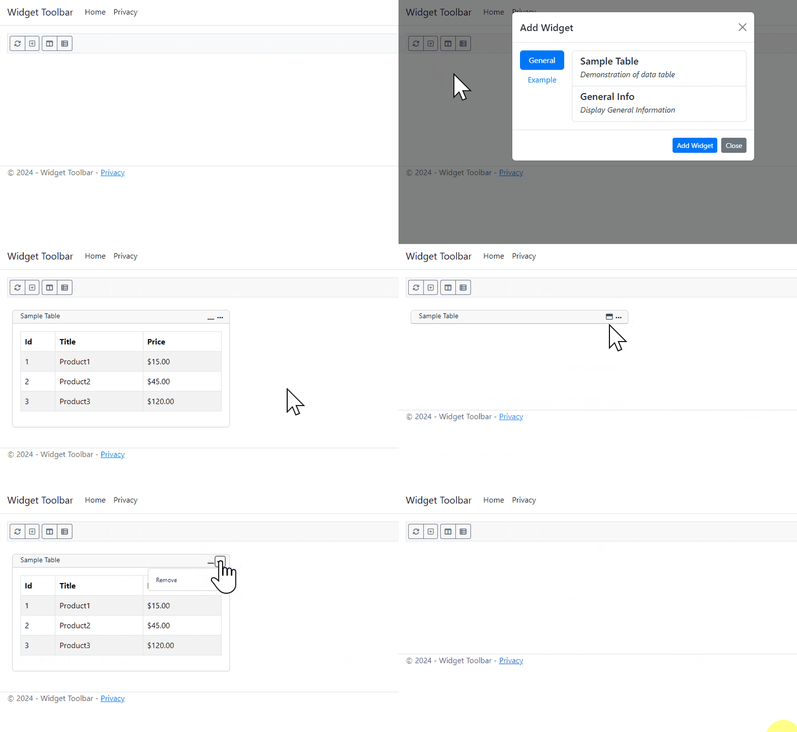
With everything in place, we can see how our minimize/restore button works on a particular widget.
Conclusion
We covered a lot of material in this post by adding two types of toolbars to a widget: immediate buttons for quick actions and a dropdown menu for additional functionality specific to widgets.
Here are a couple guidelines I've used in past dashboards:
- Too many toolbar buttons on a widget may overwhelm the user. Keep the widget's toolbar to a maximum of three buttons.
- The buttons on a widget's toolbar should be quick, one-click functionality not impeding the user's experience (non-destructive or cosmetic). For example, the minimize/restore button would be considered a quick-access, essential, and commonly-used button.
- For more detailed or destructive widget functions, the dropdown menu would create a better experience for users. The remove widget option would be considered a destructive or manipulative button to place in a dropdown since it can't be clicked accidentally.
- If you have too many options in a widget's dropdown, identify which items are absolutely critical to the widget. Could the item be moved out to a dialog? Also ask whether the item could be moved to a higher-level, possibly the Tuxbar for global widget functionality or settings.
The following is a list of widget functions I've included in dashboards over the years.
- Remove
- Refresh
- Duplicate
- Properties/Settings
While some of these functions are considered essential, again, we don't want to overwhelm the user with too many options.
What's Next?
- Introducing Tuxboard
- Layout of a Tuxboard dashboard
- Dashboard Modularity using Tuxboard
- Moving Widgets in Tuxboard
- Creating a Tuxbar for Tuxboard
- Managing Layouts in Tuxboard: Simple Layout Dialog
- Managing Layouts in Tuxboard: Advanced Layout Dialog
- Adding Widgets with a Tuxboard Dialog
- Using Widget Toolbars (or Deleting Widgets)
- Creating User-Specific Dashboards
- Creating Default Dashboards using Roles
- Creating Default Widgets using Roles
- Creating Custom Tuxboard Widgets
Full examples located at Tuxboard.Examples.
