Web Design Trends for 2016
Here we are in the final stages of 2015. Let's take a peek forward and see what 2016 has in store for us.

Since my redesign of DanylkoWeb, I've been looking ahead and watching some of the web design trends for 2016.
I know, I know, we aren't even in 2016 yet, but we're close.
The future design trends of 2016 are just building off of what we've experienced and encountered in 2015.
In today's post, we'll cover what's happened this year and how to prepare for the design changes to your website in the coming year.
2015 Web Design Trends
Card-based Layouts
As I mentioned in my redesign post, I took a cue from all of the major sites and how they were using a card-based layout. Sites such as Pinterest, Google Now, and UgsMag uses card layouts as their primary design.
This design was even mentioned back in 2014 for those wanting to be on the cutting edge.
For me personally, I used Bootstrap and Masonry to build the card layout.
The great thing about Bootstrap is the automatic responsive design you get when you use their CSS grid system.
For example, I wanted four of the latest posts to headline "above-the-fold" when people visited the site. No matter what the size of their screen, it would adapt to it.
If you look at the code for my website for each card, you'll see:
<div class="col-lg-3 col-md-4 col-xs-12">
Notice the list of classes? I consider this the secret sauce as to why Bootstrap has become so popular.
Bootstrap is based on a grid layout with a total of 12 columns and works with percentages.
If we are using a large (lg) device (possibly a desktop) and want each card to take up 3 columns of the 12, we use the class "col-lg-3".
If we want to make it look good on a medium (md) device and want to display on only 3 columns, we would use the class "col-md-4".
Finally, if we look at the website on a smart phone (xs for extra small), we only want one card displayed on the screen so that would mean we make each card the full width of the phone by using "col-xs-12" because the full width would take up to 12 columns.
All of that responsive functionality in one simple line.
Next is the display of all of the cards "below the fold." These cards are positioned using Masonry.
Once you have the JavaScript in place, you tell Masonry what is the container ("<div class='card-list'>"), tell what the child items are in that list ("<div class='card'>"), and issue the masonry command and it automatically lays out the cards based on the width of the container.
Responsive Design
Ever since Google mentioned they were moving towards a mobile web and suggested others do the same, responsive design became the big thing this year. Web designer's even coined the term "Mobilegeddon" because not many were ready for it and it would've lowered their search engine results ranking.
I know a lot of designers are saying that a majority of websites are starting to look the same because they all use the same CSS framework like Bootstrap, Skeleton, or Foundation.
I disagree.
They are merely tools to assist with the development and design of the site, they aren't 100% of the website. How you add color, fonts, and images to the site is entirely your process. The CSS frameworks provide just what the term implies: structure.
Nowadays, it's easy to make your site responsive by strictly doing your homework and leveraging a CSS framework to perform all of the heavy lifting.
If you are serious about making your website responsive, one technique I would recommend is to find a competitor website you like and examine their site using FirstSiteGuide.com Site Analyzer. This provides an overview of the site's technologies you could mimic on your own site.
Flat Design
It seems flat design is not going anywhere anytime soon either.
I do understand why we moved away from gradients because it took 100% of the CPU to render properly on the client providing a poor user experience.
Flat Design is catching on like wildfire and is meant for a sleeker, thinner web. It's kind of like the cousin to minimalism and provides a solid (not gradient) clarity of the web.
Again, there are so many UI kits out there to accomplish a flat design that I couldn't possibly cover every one of them, but here are a couple to get you started:
Hamburger Menu
Ok, honestly...how many of you hate/love that hamburger menu icon?
Whether you hate it or love it, it's becoming the standard of how people are finding their menu options.
The hamburger is already implemented in Bootstrap and used in a number of others. Just in case you need a quick one without a library:
<h2>☰</h2>
Just make sure that it's big enough for the users to notice it. :-)
2016 Web Design Trends
Since 2016 is just a continuation of 2015, you will see some of these same 2015 design trends bleed into 2016 along with some new trends.
Creativity Returns (or the end of "Cookie-Cutter" sites)
While this isn't anything geared towards a particular technology, it begs for the return of custom websites.
How many WordPress themes are becoming the same based on a parallax scrolling page and the same hero image at the top?
A while ago, I posted a Morning Coffee Link I found demonstrating why All Websites Look The Same.
'Nuff said.
Cinemagraphs
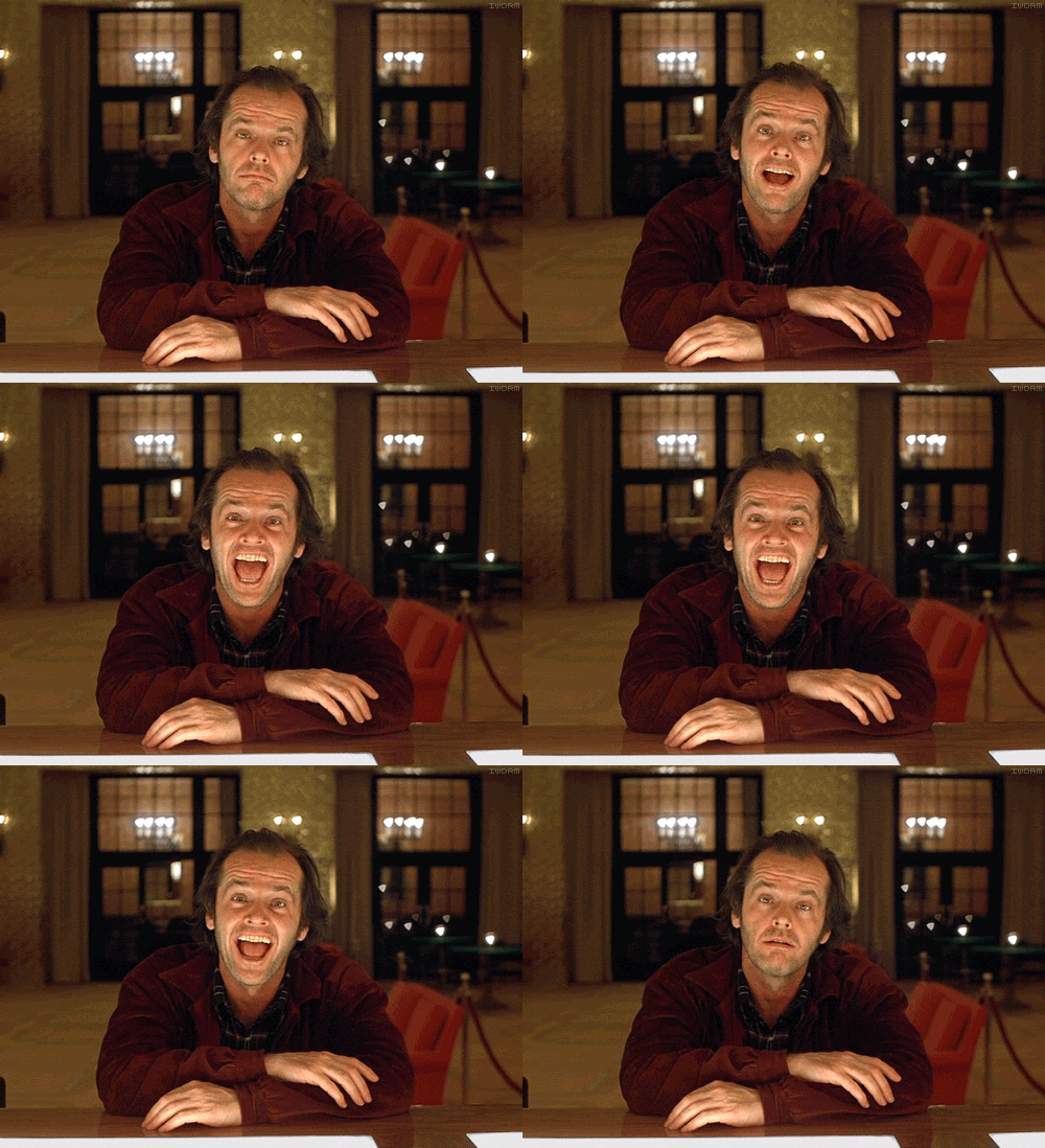
Did that picture just...move? It's not the same as a downloadable video in the background, but it is smaller. They are essentially GIF that continuously loops.
The history of a cinemagraph is quite interesting as well as I've found on photography.tutsplus.com
Here is an example of one that I absolutely love.

These cinemagraphs are becoming more and more popular. It's also pretty cool to see the expressions on people's faces when something actually moves. ;-)

Cinemagraphs aren't that difficult to make. The hardest part is getting a video sample that doesn't have a lot of movement.
Based on everything I've been seeing on the web, you can create one with either Adobe Photoshop or find a smartphone app (like here) to do it for you. Yes, you can create one on your smartphone.
If you want to pursue the Adobe Photoshop method, there is a simple tutorial over at HubSpot on how to create a cinemagraph in 7 easy steps.
Material Design Lite will explode
In 2014, Google announced their Material Design specification to provide a better UI experience across all platforms and devices.
Recently (six months ago, I think), they announced Material Design Lite to bring a library of vanilla components and templates to HTML, CSS, and JavaScript.
These templates and components are based on the paper elements of Polymer and use a basic syntax to make all of your sites across all devices look relatively the same.
With all of us using each separate libraries from Google, I think 2016 will be the year where we all meet at a cross-roads where the combination of Material Design Lite with Web Components and AngularJS will complete this suite of development tools.
CSS Shapes will take "form"
Sorry, couldn't resist that. ;-)
As mentioned above, we need to spark more imagination and creativity instead of using "cookie-cutter" websites.
Now I know we only have square boxes and grids to work with on a web page, but could 2016 finally be the year where CSS Shapes takes off and we don't need to worry about [box] angles and we focus more on curves instead?
Conclusion
I'm hoping this trendy discussion moves some designers forward into 2016. While we can't tell the future, it's always great to speculate on how web design will evolve for next year.
Did I miss a trend for next year? Post your comments below. I welcome all of them. :-)


