Why Bootstrap 4 and FontAwesome 5 Are A Killer Combo
Bootstrap and FontAwesome go together like PB and J. In today's post, I show a number of techniques on making the most of these two in your web projects.

Since 2012, Bootstrap has become one of the most used CSS library. Along with the introduction of Bootstrap from Twitter, other addons were introduced to enhance Bootstrap to get more designers (and even developers) interested in the library.
I even started writing Bootstrap TagHelpers in .NET Core to make the HTML a little easier to write.
Six years ago, the font and icon library called Font Awesome appeared and allowed users of the library to include it seamlessly into Bootstrap.
Once these two were introduced together, the designs started flowing. So much that even the White House used their icons (LOVE this video!).
However, most of the designs were snippets and not too much in the ways of development.
Today, I wanted to show a number of tips on how to use Bootstrap with FontAwesome together to create some interesting UI concepts and techniques.
Icon Buttons
One of the easiest tricks is to take a FontAwesome icon and add it to a Bootstrap button.
For example, here's a simple Save button using FontAwesome's Save icon ("fas fa-save").
<button type="button" class="btn btn-default"><i class="fas fa-save"></i> Save</button>

A pretty simple way of getting your users to push your buttons (Sorry...had to say it).
The Processing Text Box
One of the nicest features bundled with FontAwesome are the animations you can use for your loading status.
For example, when you are typing into a text box and it's making a web API call (similar to a Google auto-suggest), you want your users to know when the call starts and finishes.
Using a Bootstrap text box and Font Awesome's animation icons makes this work.
The HTML is a Bootstrap text box with an add-on containing a Font Awesome spinner.
<div class="input-group mb-3">
    <input id="SearchTerm" type="text" class="form-control" placeholder="Search"
           aria-label="Search" aria-describedby="basic-addon2">
    <div class="input-group-append">
        <span class="input-group-text search-icon" id="basic-addon2">
            <i class="fas fa-search"></i>
        </span>
    </div>
    <div class="dropdown-menu suggestions" hidden>
    </div>
</div>
While someone is typing, the user more than likely wants to know whether it's working or not. Why not change the search icon into a spinner?
// spinner
$("i", ".search-icon")
    .removeClass("fa-search")
    .addClass("fa-spinner fa-pulse");

When the API call is done, change it back and display the results.
$("i", ".search-icon")
    .removeClass("fa-spinner")
    .removeClass("fa-pulse")
    .addClass("fa-search");
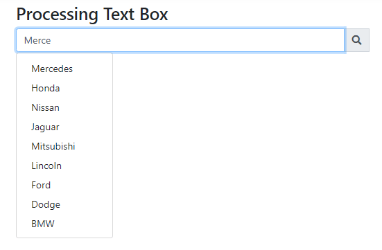
This gives the user a simple notification as to whether we're still searching for results.
This uses Bootstrap's input groups and Font Awesome's animated icons.
Loading Modal Dialog Box
Here's another technique for animated icons.
Let's say you want to load dynamic content into your modal dialog box. You don't want to bore your users by waiting for the content to load.
One approach is to make your dialog box display a "Loading..." message with a spinner while content is loading. We simply need an overlay DIV with some CSS and a touch of JavaScript.
To start, we'll use the standard Bootstrap modal code from their site.
<!-- Modal --> <div class="modal fade" id="exampleModal" tabindex="-1" role="dialog" aria-labelledby="exampleModalLabel" aria-hidden="true"> <div class="modal-dialog" role="document"> <div class="modal-content"> <div class="modal-header"> <h5 class="modal-title" id="exampleModalLabel">Modal title</h5> <button type="button" class="close" data-dismiss="modal" aria-label="Close"> <span aria-hidden="true">×</span> </button> </div> <div class="modal-body"> ... </div> <div class="modal-footer"> <button type="button" class="btn btn-secondary" data-dismiss="modal">Close</button> <button type="button" class="btn btn-primary">Save changes</button> </div> </div> </div> </div>
Simply add an .overlay div to your .modal-content (in bold).
<!-- Modal --> <div class="modal fade" id="exampleModal" tabindex="-1" role="dialog" aria-labelledby="exampleModalLabel" aria-hidden="true"> <div class="modal-dialog" role="document"> <div class="modal-content">
<div class="overlay"> <span class="fas fa-spinner fa-spin fa-2x w-100"></span> Loading... </div>
<div class="modal-header"> <h5 class="modal-title" id="exampleModalLabel">Modal title</h5> <button type="button" class="close" data-dismiss="modal" aria-label="Close"> <span aria-hidden="true">×</span> </button> </div> <div class="modal-body"> ... </div> <div class="modal-footer"> <button type="button" class="btn btn-secondary" data-dismiss="modal">Close</button> <button type="button" class="btn btn-primary">Save changes</button> </div> </div> </div> </div>
We also need some CSS to display our overlay over the entire dialog box.
.overlay {
    background: #FFFFFF;
    color: #666666;
    position: absolute;
    height: 100%;
    width: 100%;
    z-index: 5000;
    text-align: center;
    padding-top: 10%;
    -ms-opacity: .80;
    opacity: .80;
}
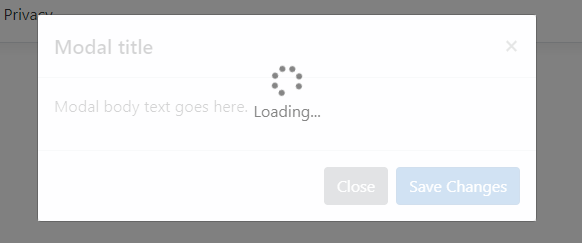
The idea behind this concept is to immediately show a loading indicator letting the user know we are loading remote content and we'll let them know when it's ready by hiding the overlay. After the content loads, the overlay will disappear.
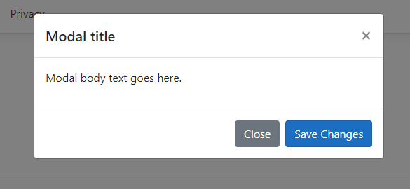
After we're done loading the content and adding it to the .modal-body, we hide the overlay (I'm simulating this with a timeout. You can just as easily add a .fetch for your content).
// Loading Modal Dialog Box
$('#exampleModal').on('show.bs.modal', function (e) {
    var overlay = $(".overlay");
            // hide the overlay after 3 seconds.
    setTimeout(function () {
        $(overlay).hide();
    }, 3000)
})
This technique uses Bootstrap's Modal and FontAwesome's animated icons to set our users' expectations while waiting for a dialog box to load.
Kebab Dropdown
One of my recent projects (which I'll announce soon) requires a dropdown menu off of a button group.
Luckily, we have a code example on Bootstrap's website (under Nesting Button Groups)
We can achieve a Kebab menu at the end with the Font Awesome's vertical ellipsis ("fas fa-ellipsis-v") icon, but there's one problem with this button group.
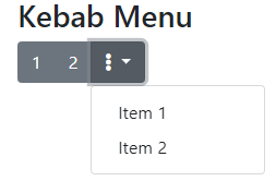
The last item is a dropdown with a caret. It doesn't give it a minimalist approach.
Kind of sticks out, doesn't it?
We need to remove the arrow. Most users see the ellipsis as a "More Options."
To remove it, just use a little CSS to remove the dropdown arrow.
/* Kebab Menu */
.kebab .dropdown-toggle:after {
    display: none;
}
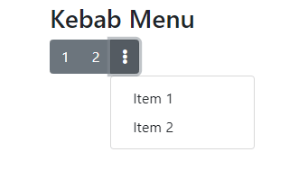
This uses Bootstrap's button group and FontAwesome's vertical ellipsis.
Using Colored Icons for Ordered and Unordered Lists
One feature I thought was pretty neat was the ability to add colors to the background of the icon.
<ul class="fa-ul" style="font-size: 2rem">
    <li><span class="fa-li"><i class="fas fa-fw fa-seedling" style="background: lightgreen"></i></span>Spring</li>
    <li><span class="fa-li"><i class="fas fa-fw fa-umbrella-beach" style="background: lightyellow"></i></span>Summer</li>
    <li><span class="fa-li"><i class="fas fa-fw fa-leaf" style="background: brown"></i></span>Fall</li>
    <li><span class="fa-li"><i class="far fa-fw fa-snowflake" style="background: whitesmoke"></i></span>Winter</li>
</ul>
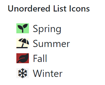
Recently, the premium version of FontAwesome released DuoTone icons. Duotone icons allow multiple colors in a single icon.
While this isn't available in the free version (what I'm using now), the coloring of icons within FontAwesome is really versatile.
This uses the ordered and unordered icon lists from FontAwesome.
All of the code for this post is located at:
Conclusion
I've been using Bootstrap and FontAwesome together for years and I keep finding new tips and tricks the more I use them.
This combination of versatile icons with a solid CSS framework and JavaScript library continues to amaze me every time I design screens.
How do you use Bootstrap and FontAwesome? Are there any cool techniques you'd like to share? Send me your own tips for a future article? Post your comments below and let's discuss.
